This project focused on the visual modernisation of Western Sydney University’s website. I led a series of collaborative workshops with the client to explore future directions, align on messaging goals, and define what was both creatively compelling and feasible within project timelines. In addition to designing and facilitating these workshops, I mapped out key user journeys and delivered a full range of design outputs, from basic wireframes to high-fidelity prototypes. I also developed the complete UI component library for every section of the website. Throughout the process, the focus remained on balancing the university’s strategic goals with the needs of current and future students, as well as alumni.
01. Overview
Western Sydney University, one of Australia’s leading institutions, needed a major overhaul of its website ahead of an upcoming Open Day. The existing site was visually outdated and difficult to navigate, making it harder for prospective students, current students, alumni, parents, and staff to quickly find the information they needed. With a tight timeline, the university required a modern, accessible, and easy-to-maintain website that reflected its brand identity and delivered a streamlined user experience.
02. Problem
Before the redesign, the university’s website suffered from:
• Outdated design that no longer reflected a modern academic institution.
• Overloaded navigation, with excessive links and no clear hierarchy.
• Inconsistent layouts and patterns across different pages, creating confusion.
• Redundant pages and scattered information that required too many clicks to reach important content.
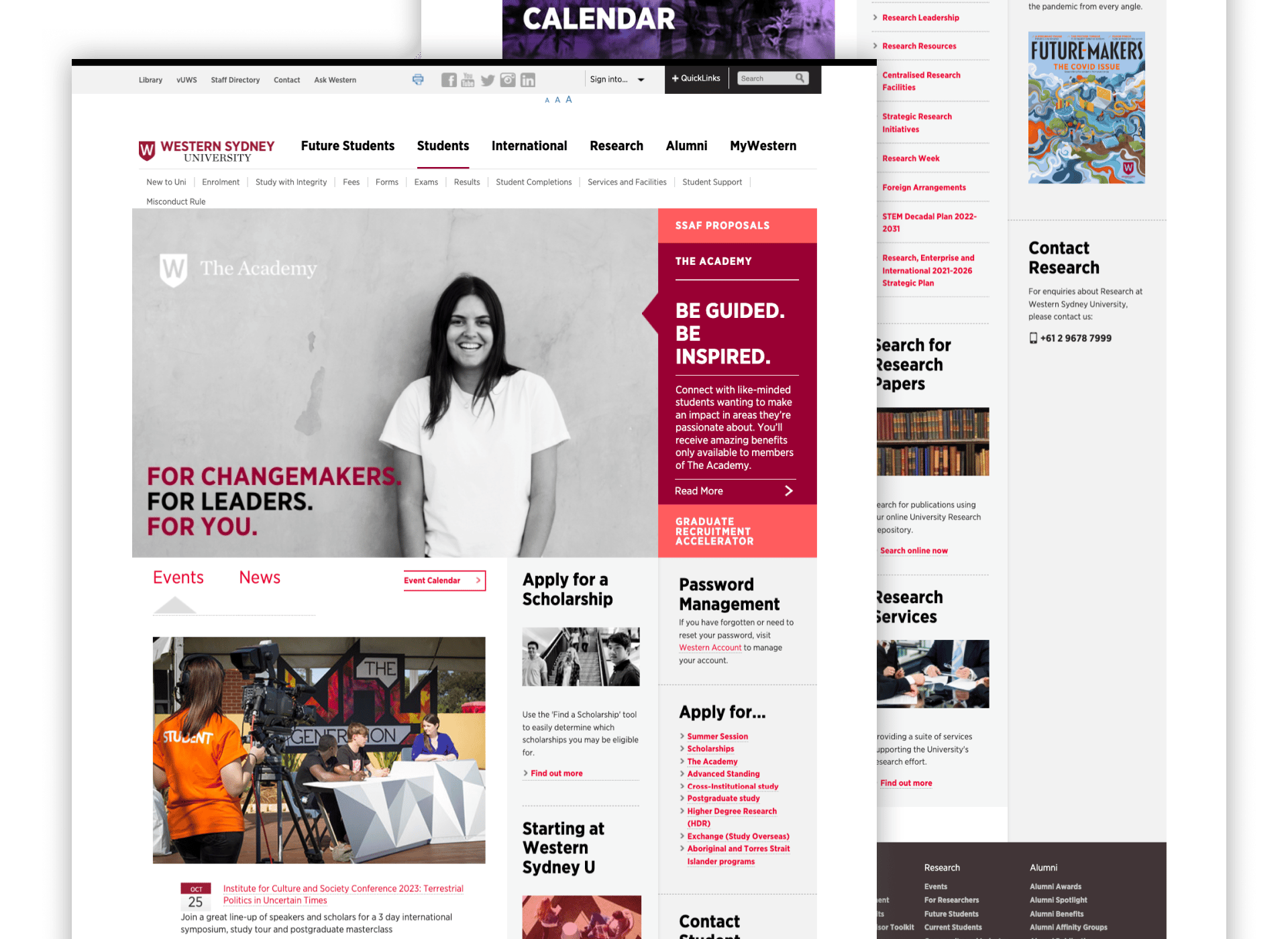
The old homepage was cluttered, with multiple top menus, redundant links, and limited visual hierarchy. The layout lacked engaging visuals or clear pathways for any of its diverse audiences, prospective students, current students, alumni, parents, and staff. This one-size-fits-all approach meant that none of these groups had a dedicated, intuitive starting point for their journey, often leading to frustration and drop-offs.
03. Design Process
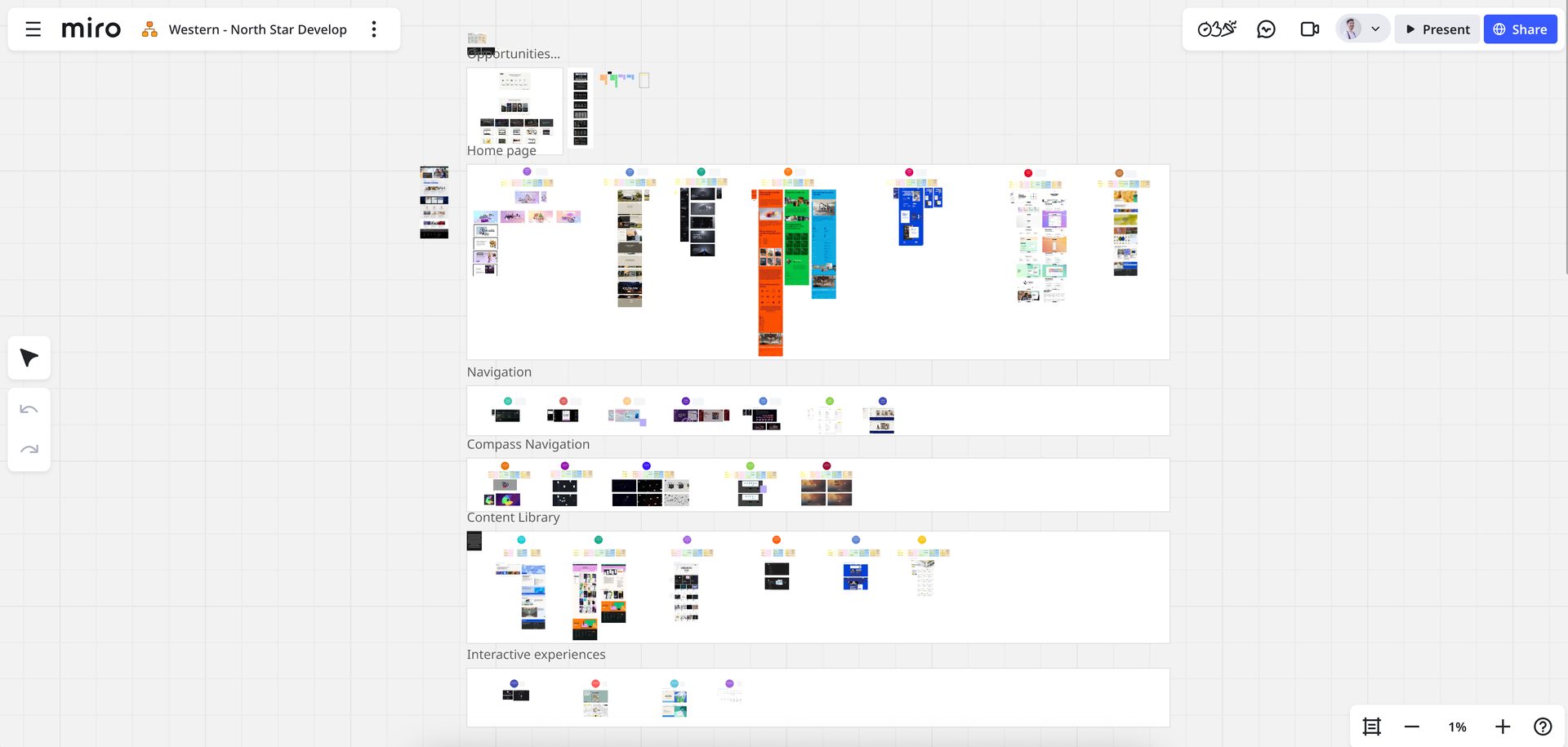
Our collaboration began with a series of interactive workshops with the marketing and communications team. Using Miro, we mapped out user journeys for each audience type, including tasks like finding a course, applying for admission, accessing alumni resources, and locating parent information. This exercise helped identify navigation bottlenecks and content redundancies for every user group.
Next, I restructured the information architecture into a simplified, logical hierarchy, reducing unnecessary links and grouping related content intuitively.
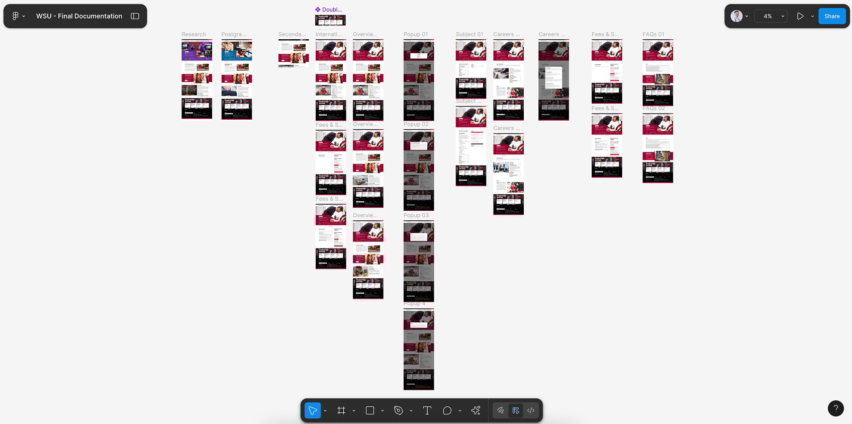
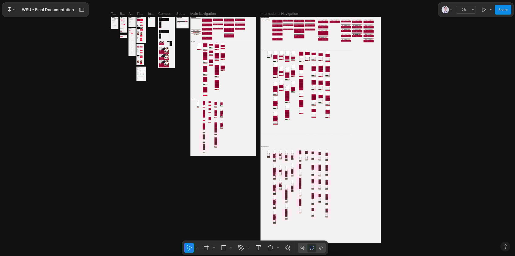
I then designed a UI component library in Figma, including buttons, headers, footers, cards, and form elements, all aligned with the university’s brand guidelines. This design system allowed for visual consistency across the site and made it easier for the internal team to create new pages without breaking the style.
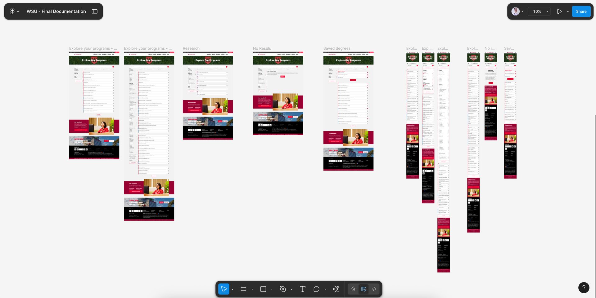
Finally, I moved from low-fidelity wireframes to high-fidelity prototypes, incorporating the updated visual style, accessible typography, and responsive layouts. These designs were handed over to the development team with detailed specifications, ensuring smooth implementation.
Workshop
Website Navigation
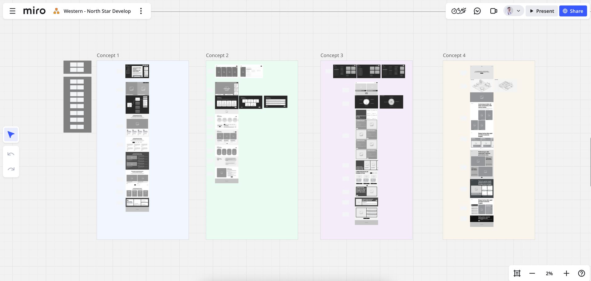
Concepts
Home page
Course page
Components
04. Solution & Results
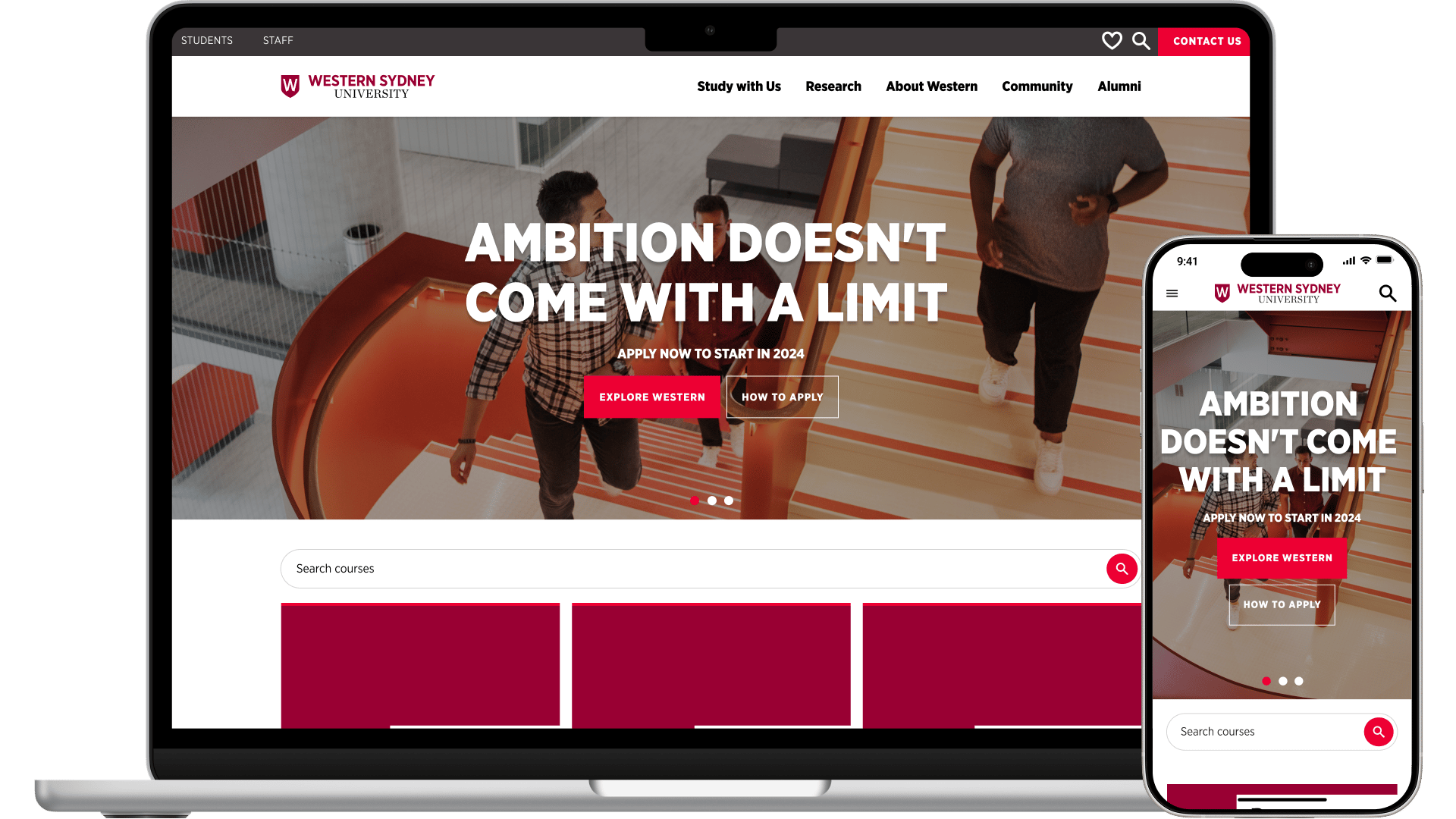
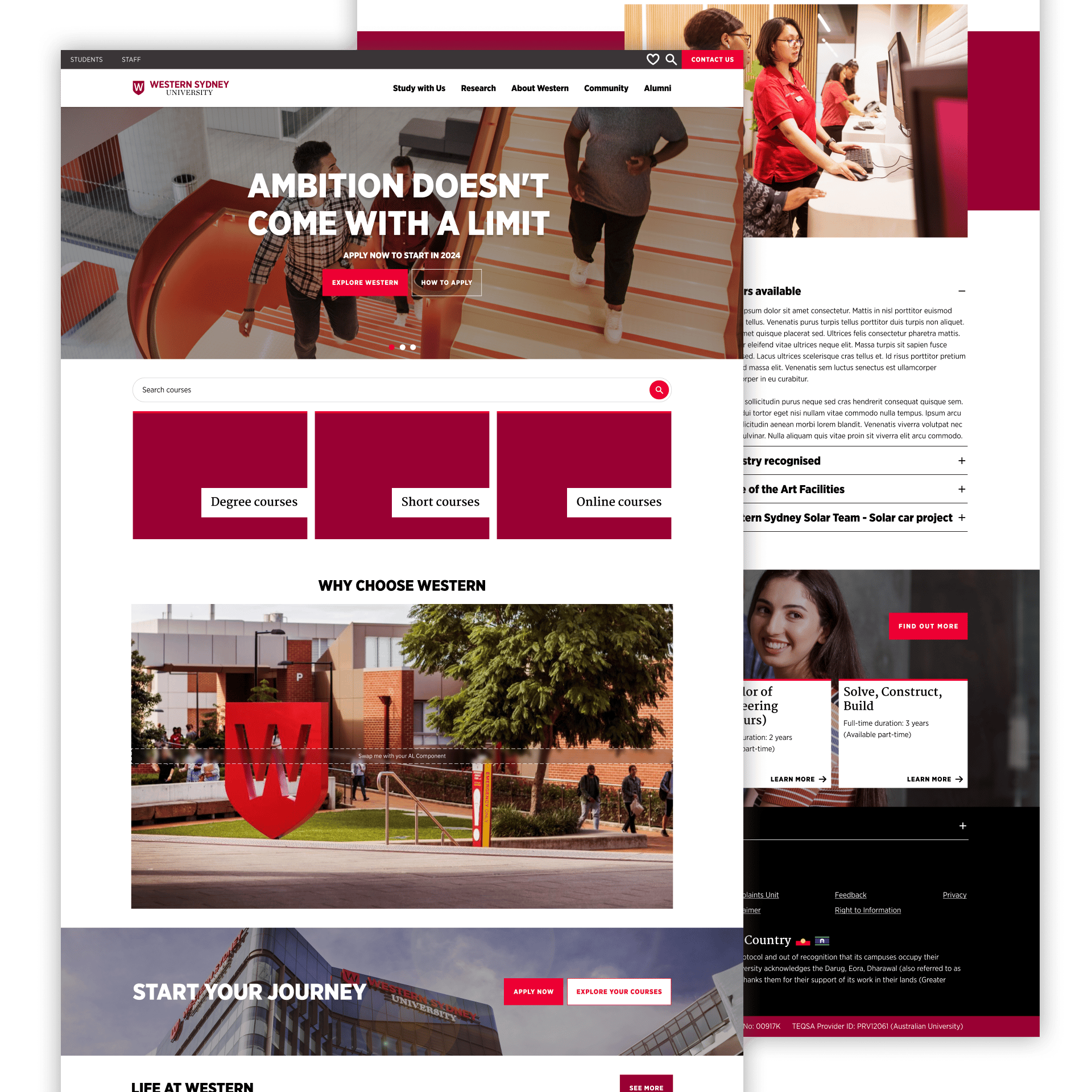
The redesign transformed the homepage into a modern, brand-aligned gateway that recognises and caters to each audience type. Now, prospective students, current students, alumni, parents, and staff all have clearer entry points and dedicated sections that guide them towards relevant content.
Streamlined navigation, clear calls-to-action, and a well-structured layout prioritise usability while maintaining the university’s visual identity. Updated typography, improved visual hierarchy, and modular components provide both a better experience for users and easier site maintenance for the internal team.
The project launched in time for the Open Day and received positive feedback from both internal stakeholders and users, who found it significantly easier to navigate. While no formal analytics were collected, qualitative feedback highlighted:
• Improved ease of use for all audience groups, especially prospective students and parents.
• Greater visual alignment with the university’s modern brand identity.
• Reduced maintenance time for the internal team thanks to reusable UI components.
This project underscored the value of stakeholder collaboration through workshops and the long-term benefits of investing in a robust design system, especially when working under tight deadlines.